From Zero Orders to a Billion: Designing the First App at Farm Hill
In the early days of Farm Hill, everything looked promising—except the numbers.
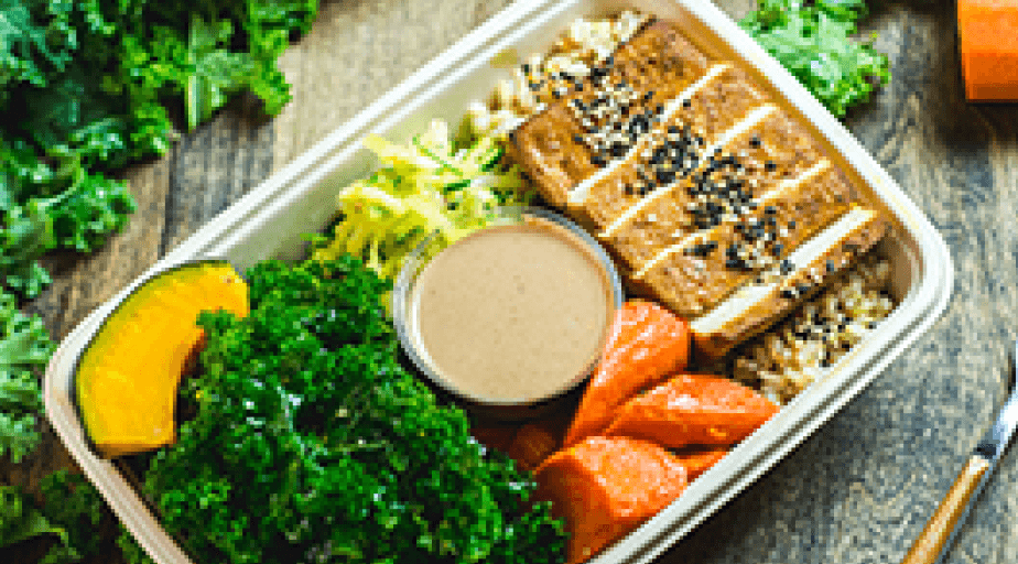
The food was handcrafted by a top chef. The ingredients were fresh, local, and clean. A tiny team handled prep, delivery, and logistics with the kind of hustle only startups know. But when it came to customer orders…crickets.
We were six months in with barely 60 orders a week. The website wasn’t converting. Marketing couldn’t fix it. And the clock was ticking. We were burning through our runway.
That’s where I came in.
I joined to design our first mobile product, but quickly found myself doing far more: researching customer needs, shaping product strategy, and occasionally driving food across the Bay Area when we were short on drivers. There was no roadmap, no design system—just a clear mission: get people to order lunch.
9:41

$64.25
423 Woodside Ave, CA
Search Farmhill
Asian
Beef
Vegetarian
Egg
Drinks
Shellfish
Recommended for you

Vegetarian
Classic Kale Tofu
$9.99
#1 Most loved • 4.8 (34)
Vegetarian
Classic Kale Tofu
$9.99
#2 Most loved • 4.7 (24)
Chef’s specials

Asian inspired
Classic Kale Tofu
$9.99
Under 500 calories
Fish
Classic Kale Tofu
$9.99
Under 500 calories
Most loved

Garden Salad
375cal
Fish

Garden “Sushi” Roll
450cal
2

The problem
We had food and a delivery team. What we didn’t have was a digital storefront that made it easy—or desirable—to order. Our website was clunky, offered zero personalization, and buried nutritional info behind multiple clicks. Worse: it wasn’t mobile-friendly. For a health food company, it was like trying to sell smoothies out of a broken vending machine.
We needed an app.
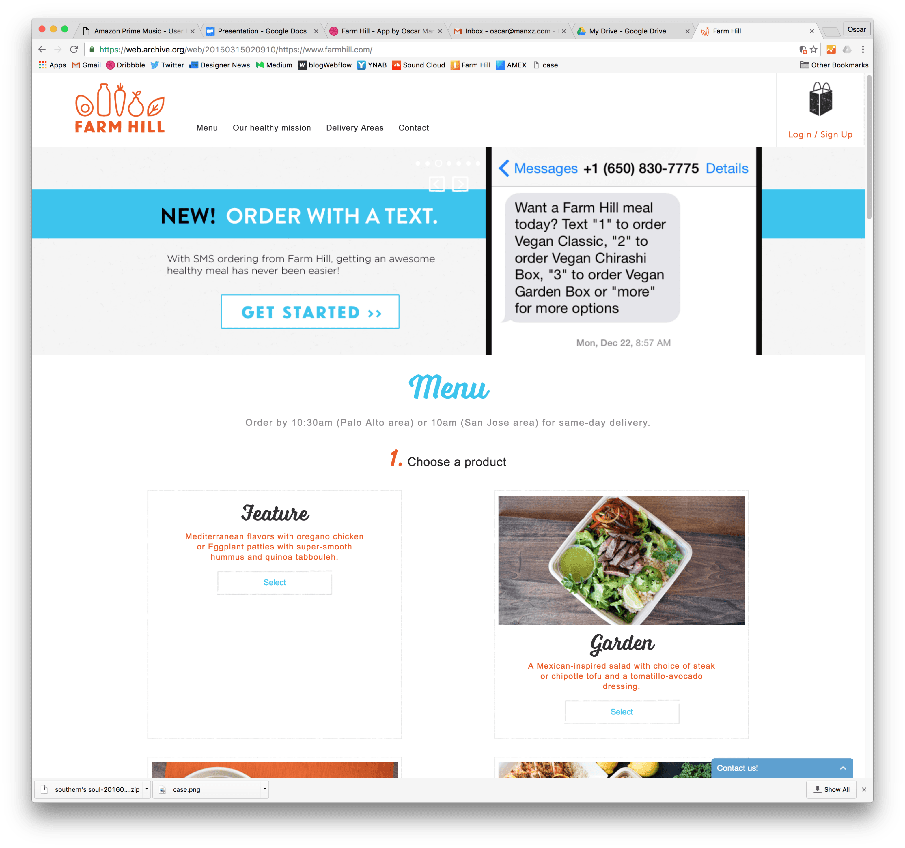

Built for desktop.
Used on mobile.
Failed everywhere.
We assumed people ordered from their desks. But 92% were on mobile.
The site didn’t stand a chance.
The approach
At startups, you don’t research in labs—you learn on the fly. And at Farm Hill, we were flying blind.
There were no dashboards, no conversion funnels, no analytics tools blinking red. All we had were whispers: a few emails from confused customers, support calls that dragged on too long, and a gut feeling that something—everything—was off.
So I rolled up my sleeves and did what made sense: I started listening.
I sat in on every support call I could. Not just to hear the issues, but to understand the tone—the hesitation, the frustration, the moment someone gave up on ordering lunch altogether. I reached out to early customers and asked simple, open-ended questions. Why didn’t they reorder? What stopped them? Sometimes they answered. Sometimes they ghosted. But the patterns were there.
The biggest “aha” moment didn’t come from a spreadsheet. It came from watching a friend try to place an order on their phone. They tapped. They squinted. They gave up.
That’s when it clicked: the website wasn’t just bad—it was blocking people from ordering. On mobile, it was nearly unusable.
So I started working on our mobile app.
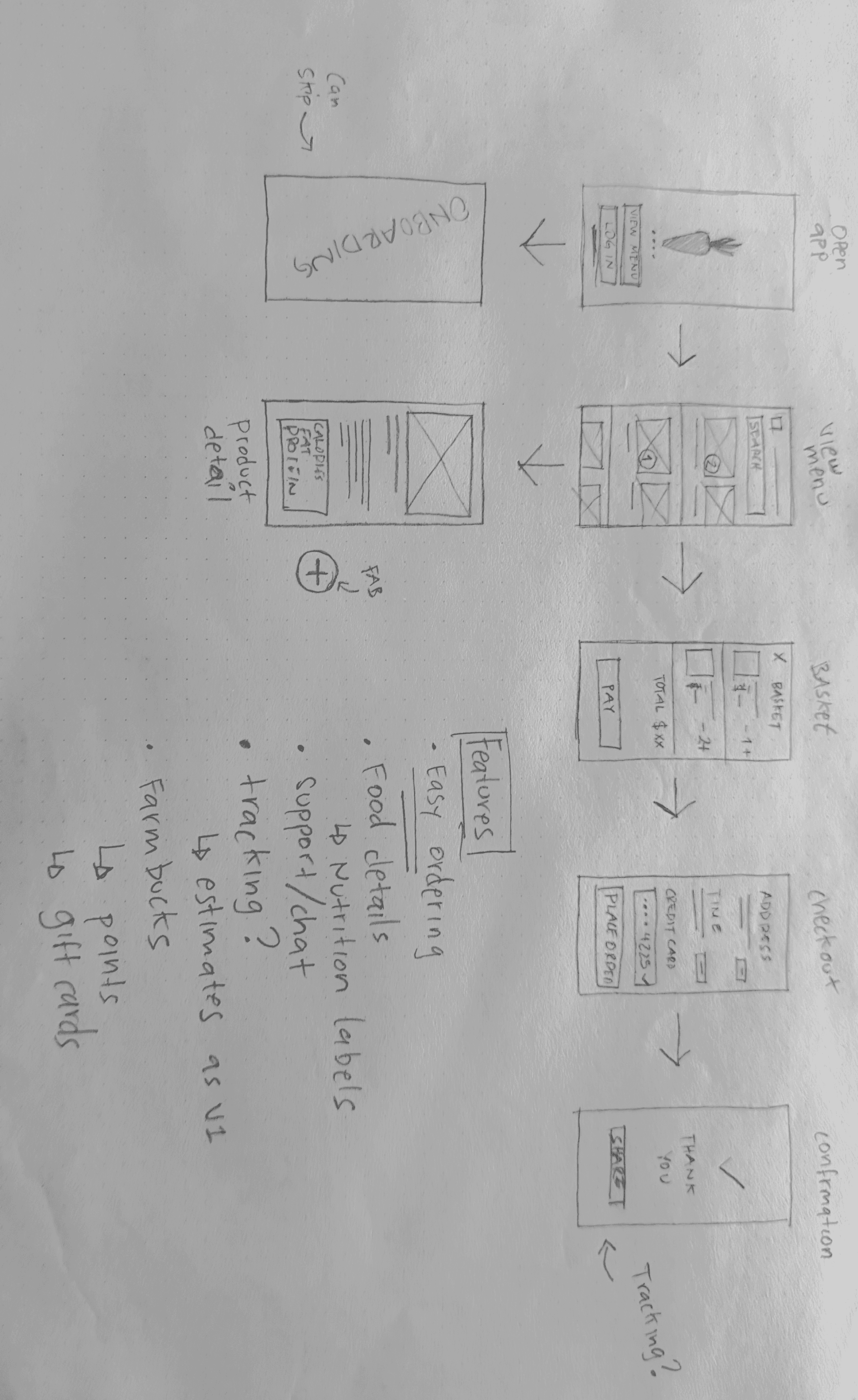
Old pencil sketch of happy path flows with initial questions
I started with pencil sketches on an old beat-up moleskin notebook my grandma had given me for graduation some years back: messy flows, rough boxes, arrows crisscrossing like spaghetti. I wasn’t polishing screens—I was mapping intent.
What’s the fastest path from craving to checkout?
View menu
Sign in
Welcome
Menu
Basket
$9.99
$9.99
$9.99
Check out
Cart
Check out
123 Street, CA
VISA ••••3422
Total
$29,97
Place order
Check out
Happy path flow to checkout
Our first layout was bold—and wrong.
We launched with a full-screen, Tinder-style swipe interface, thinking it would make the ordering experience feel modern, fun, and focused. One meal per screen. Swipe left, swipe right, just like deciding what’s for dinner on a dating app.
It was beautiful. It was immersive. And it totally broke once we had more than five meals on the menu.
Users got tired of swiping. They couldn’t compare meals side-by-side. And when we added new dishes mid-week, those options often got buried. The interface that felt “delightful” in theory quickly turned into friction.
9:41
423 Woodside Ave, CA
Classic Kale Tofu
$9.99
2
9:41
423 Woodside Ave, CA
Classic Kale Tofu
$9.99
Classic Kale Chicken
$9.99
Classic Kale Tofu
$9.99
2

Users got tired of swiping very quickly. They complained that it was hard to compare meals.
This layout lasted less than a week.
We pivoted to a long, vertical scroll, anchoring each meal with big, bold photos that let users scan quickly and make decisions visually. It wasn’t flashy, but it worked.
It scaled with our menu. It made discovery easier. And it played to what mattered most: the food.
That shift—from a design we loved to one our users actually needed—was a turning point. It reminded me that good UX isn’t about being clever. It’s about being clear. And scalable.
Once we switched to the long scroll layout, things got better—fast. People were browsing more, tapping more, ordering more.
What started as a simple menu app quickly evolved into something more layered. We were no longer solving for “Can I place an order?” We were solving for speed, personalization, and trust.
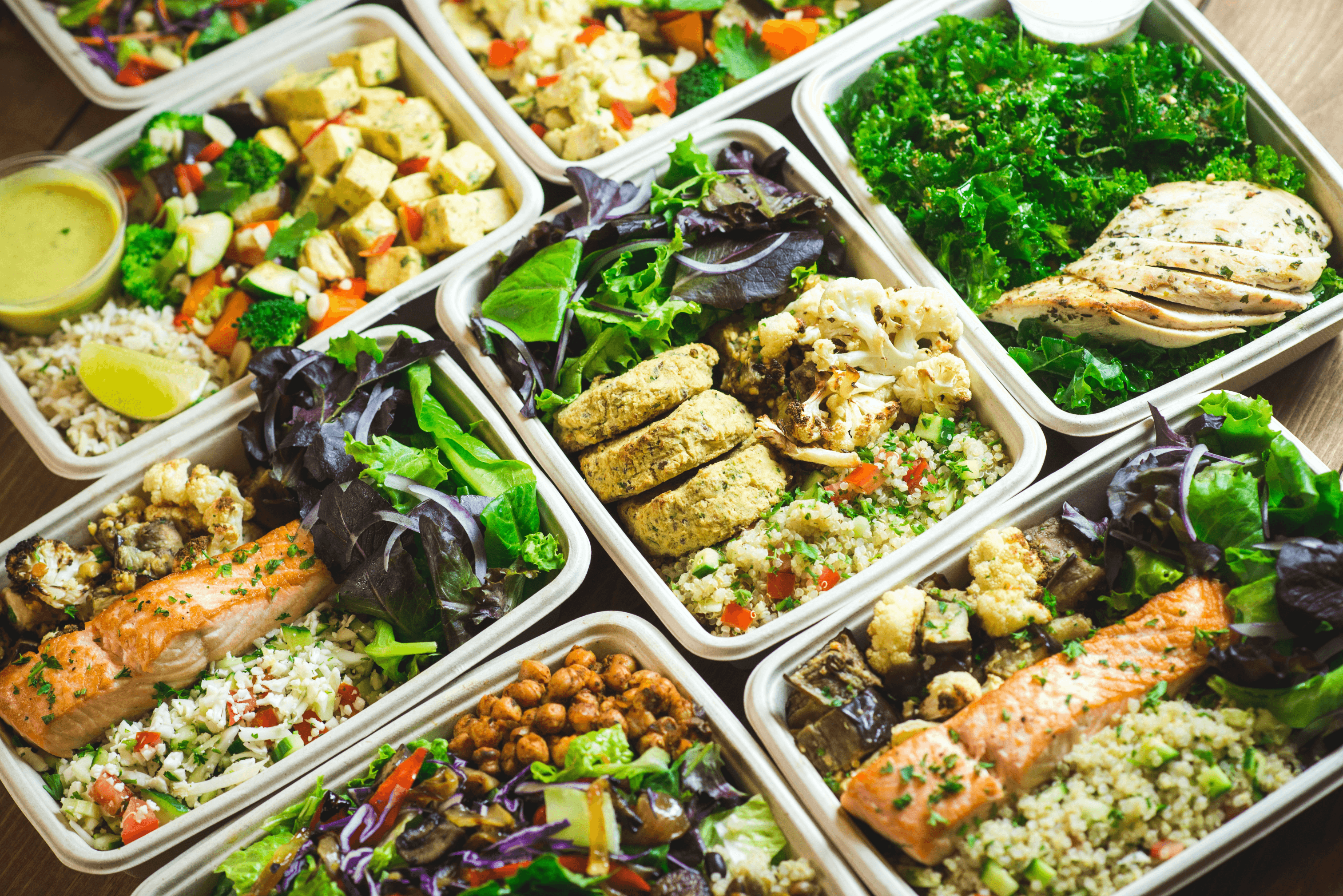
A spread of some of our most popular dishes. The falafel was my favorite.
Switching to the scroll layout solved one problem—but opened the door to many more.
Almost immediately, we started hearing it:
“Can I search for meals?”
“Where’s that kale bowl I loved last week?”
“Do you have low-carb options?”
With more users and a growing menu, the long scroll started to feel… long. People wanted to move faster.
They wanted structure, and shortcuts.
9:41
423 Woodside Ave, CA
Search Farmhill
Classic Kale Tofu
$9.99
Classic Kale Tofu
$9.99
Classic Kale Tofu
$9.99
Q
W
E
R
T
Y
U
I
O
P
A
S
D
F
G
H
J
K
L
Z
X
C
V
B
N
M
123
space
return
Search
So we added search.
Fast, forgiving, and always visible at the top of the menu. Users could type in ingredients (“chicken,” “kale”), meal names, or even vague terms like “low carb,” and find what they needed. It was lightweight but powerful—one of the most impactful features we shipped, and one of the easiest to use.
Next came categories and tags.
With more meals, people wanted to filter. So we added tap-to-filter tags—like vegan, gluten-free, high protein, spicy—right under the search bar. These tags gave the scroll more meaning and helped users instantly narrow the menu based on what they cared about.
Tags
9:41
423 Woodside Ave, CA
Search Farmhill
Asian
Beef
Vegetarian
Egg
Drinks
Shellfish
Vegetarian
Classic Kale Tofu
$9.99
Classic Kale Tofu
$9.99
Classic Kale Tofu
$9.99
Q
W
E
R
T
Y
U
I
O
P
A
S
D
F
G
H
J
K
L
Z
X
C
V
B
N
M
123
space
return
Categories
Designing with data
By this point, we had the basics down: people could find meals, filter for dietary needs, and place an order quickly.
So we started experimenting.
Let’s say you’re someone who checks ratings before buying anything. Open the app—and the top meals you see have glowing stars, user quotes, and feedback front and center.
Or a budget-conscious user? The most affordable meals quietly float to the top. No judgment, no labels. Just relevance.
Now imagine someone else: they’re training for a marathon, tracking protein and carbs. Same app, but now the meals are lean, the nutrition info is front and center, and there’s less noise about reviews or price.
Q
W
E
R
T
Y
U
I
O
P
A
S
D
F
G
H
J
K
L
Z
X
C
V
B
N
M
123
space
return
9:41

423 Woodside Ave, CA
Search Farmhill
Asian
Beef
Vegetarian
Egg
Drinks
Shellfish
Recommended for you
Chef’s pick
Classic Kale Tofu
$9.99
#1 Most loved • 4.8 (34)
Korean BBQ
Classic Kale Tofu
$9.99
#2 Most loved • 4.7 (24)
Last ordered

Tag

Tag
Asian inspired meals
Tag
Tag
Good for sharing
Classic Kale Tofu
$9.99
$8.99
10% Off
Drink included
Classic Kale Tofu
$9.99
$8.99
Free Delivery
Frugal
Health conscious
Gluten-free
Classic Kale Tofu
$9.99
$8.99
Low Carb
Low carb
Classic Kale Tofu
$9.99
$8.99
60g • High Protein
Every user saw a version of the app shaped around them—even though none of them ever knew it.
It was subtle. But powerful.
Under the hood
To pull this off, we used a lightweight, rule-based ML model running on-device and server-side.
Here's how it worked:
Behavioral signals were collected with clear consent: things like search patterns, app install history (fitness, food, Yelp), and ordering trends.
User preferences and filters were stored and constantly adjusted based on real interactions.
A rules engine combined deterministic logic (e.g. “if X, then show Y”) with basic clustering to nudge recommendations based on user shared behavior.
Most decisions were interpretable by design — meaning users weren’t locked into a black box. They could always filter, adjust, or override what we showed.
This made the experience feel smart without being intrusive.
Fast, without being rigid. Personalized, without feeling overly engineered.
Food item component + ML Objects
A simple object library was the engine. If X patterns were observed, we would serve specific components tailored to that specific persona.
A bit scary, but privacy was a core principle. All data collected was purely for a better experience in app, and never sold to third parties.
Health consious
Low carb
Vegetarian
Gluten-free
Seasonal
Low sodium
Spice
Spicy level
🌶️
Spicy level
🌶️
🌶️
Spicy level
🌶️
🌶️
🌶️
Athletes
Gut friendly
High protein
Great macros
Chef’s pick
Food types
Korean BBQ
Fish
Asian inspired
South American inspired
Drink included
Good for sharing
Comfort food
Practical
10% Off
#1 Most loved • 4.8 (34)
Popular in your area • 4.8 (34)
Under $10
Get it fast
Delivered in 15 min
$9.99
$8.99
ML Labels for specific personas
Final notes
We launched the app in under three months—and just like that, the switch flipped.
Orders shot up from 60 to over 1,800 a week. The team was ecstatic—and totally overwhelmed. The kitchen was in chaos. Delivery routes broke. At one point, we ran out of containers. Twice.
And still, the orders kept coming.
But we didn’t stop. We stayed close to the experience, kept listening, and kept building. We added Favorites so people could reorder without thinking. We rolled out Chat Support to catch issues in real time. And we introduced Farm Bucks, a lightweight rewards system that quietly turned occasional customers into regulars.
I remember one night in the office, long after the last delivery went out. The founders were cleaning up boxes. The ops lead was asleep on a yoga mat. And one of our engineers turned to me, held up his phone, and said:
“It works. It actually works.”
This app didn’t just unlock growth—it reshaped the company around a better experience.
And a couple of years later, we were acquired by Eat Club.
Not just for its food. But for the system we’d built around it.
That’s what good design does.
9:41
$64.25
423 Woodside Ave, CA
Search Farmhill
Asian
Beef
Vegetarian
Egg
Drinks
Shellfish
Recommended for you
Vegetarian
Classic Kale Tofu
$9.99
#1 Most loved • 4.8 (34)
Vegetarian
Classic Kale Tofu
$9.99
#2 Most loved • 4.7 (24)
Chef’s specials
Asian inspired
Classic Kale Tofu
$9.99
Under 500 calories
Fish
Classic Kale Tofu
$9.99
Under 500 calories
Most loved
Garden Salad
375cal
Fish
Garden “Sushi” Roll
450cal
2
That’s it folks. Go order some lunch.
Farmhill